PayTabs SDK makes the integration with the PayTabs payment gateway very easy by providing a ready-made payment screen that handles the card entry and, billing & shipping information and completes the missing details.
This article is dedicated to walking you through how to manage the theme in this SDK to be more fit and customized to suit your business needs.
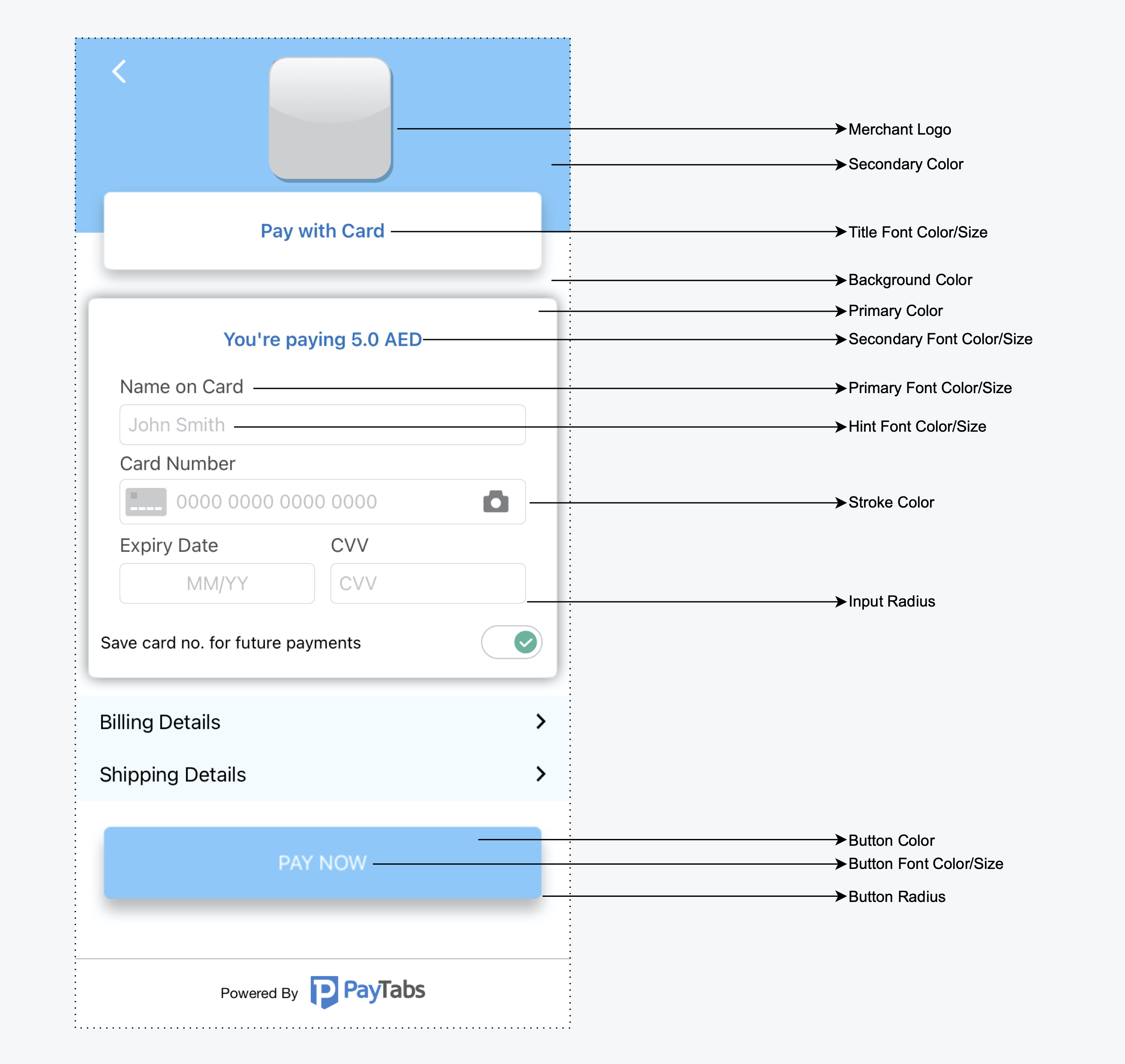
By using the following guide to customize the colors, fonts, and logo, you will be configuring the SDK's theme that will be passed to the payment configuration.
Managing Theme in this SDK is categorized into the below:
Android Overriding Resources
This indicates how to override multiple resources provided by PayTabs for more customizations to your mobile application which are listed below:
Strings
This indicates how to override strings via adding a strings.xml file to override from below with the value you want within the SDK (src/main/res/values/). As shown below the list of all attributes that you can adjust to suit your translation is listed below:<?xml version="1.0" encoding="utf-8"?> <resources> <string name="payment_sdk_3d_secure_title">"3D Secure"</string> <string name="payment_sdk_credit_card_screen_title">"Credit Card</string> <string name="payment_sdk_card_name_on_card_title">"Name on Card"</string> </resources>Find the keys with the default values here English, Arabic.
Colors
This indicates how to override colors via adding a colors.xml file to override from below with the value you want within the SDK (src/main/res/values/). As shown below the list of all attributes that you can adjust to suit your business design as listed below:
<resourse> // to override colors
<color name="payment_sdk_primary_color">#5C13DF</color>
<color name="payment_sdk_secondary_color">#FFC107</color>
<color name="payment_sdk_primary_font_color">#111112</color>
<color name="payment_sdk_secondary_font_color">#6D6C70</color> <color name="payment_sdk_separators_color">#FFC107</color>
<color name="payment_sdk_stroke_color">#673AB7</color>
<color name="payment_sdk_button_text_color">#FFF</color>
<color name="payment_sdk_title_text_color">#FFF</color>
<color name="payment_sdk_button_background_color">#3F51B5</color>
<color name="payment_sdk_background_color">#F9FAFD</color>
<color name="payment_sdk_card_background_color">#F9FAFD</color>
<color name="payment_sdk_status_bar_color">#FFC107</color>
</resourse>
Dimen
This indicates how to override dimens via adding a dimen.xml file to override from below with the value you want within the SDK (src/main/res/values/). As shown below the list of all attributes that you can adjust to suit your business design as listed below:
<resourse>// to override dimens
<dimen name="payment_sdk_primary_font_size">17sp</dimen>
<dimen name="payment_sdk_secondary_font_size">15sp</dimen>
<dimen name="payment_sdk_separator_thickness">1dp</dimen> <dimen name="payment_sdk_stroke_thickness">.5dp</dimen>
<dimen name="payment_sdk_input_corner_radius">8dp</dimen>
<dimen name="payment_sdk_button_corner_radius">8dp</dimen>
</resourse>
Fonts
You can overwrite your application fonts by adding your custom fonts files named as shown below in your project at this specific folder path (src/main/res/font):
payment_sdk_primary_font.tff
payment_sdk_secondary_font.tff
Drawables
You can overwrite your application drawables such as the back button icon by adding your own drawable file named as shown below in your project at this specific folder path (src/main/res/drawable):
payment_sdk_back_arrow.xmlHandle night/light mode
You can handle this via adding the overrides light XML files inside the directory (src/main/res/values/) and the dark XML files in the directory (src/main/res/values-night/)
iOS Overriding Resources
Theme
Use the following guide to customize the colors, font, and logo by configuring the theme and pass it to the payment configuration.
var theme = cordova.plugins.CordovaPaymentPlugin.PaymentSDKTheme
theme.backgroundColor = "e0556e"; // Color hex value
configuration.theme = theme;
You can find the list of all PaymentSDKTheme object attributes that you can adjust to suit your business design as listed below:- logoImage
- secondaryColor
- secondaryFontColor
- secondaryFont
- primaryColor
- primaryFontColor
- primaryFont
- buttonColor
- buttonFontColor
- buttonFont
- titleFontColor
- titleFont
- backgroundColor
- placeholderColor
- strokeColor
- strokeThinckness
- inputsCornerRadius
Handle dark/light mode
You can handle this via set color, for example, PrimColor, as shown below:
Then assign this color to the attribute you want, and the color will change according to the mode:them.primaryColor = UIColor(named: "PrimColor ");
⌂ To get familiar with the whole process and the other steps, kindly navigate to our "The Cordova SDK Integration Manual" solution article.

⇦ And to navigate to the previous step in the integration process "Step 1 - Setup and activate the integration method" kindly click here.

⇦ And to get familiar with the rest of the steps regarding the current step "Step 2 - Configure the integration method" click here.

⇨ Or you can navigate to the next step in the integration process "Step 3 - Initiating the payment" kindly click here.
Was this article helpful?
That’s Great!
Thank you for your feedback
Sorry! We couldn't be helpful
Thank you for your feedback
Feedback sent
We appreciate your effort and will try to fix the article